Sweet Harmony

In artwork, the main player is usually contrast. But it is color that grabs most people’s attention.  The right combination of colors can create beautiful, vibrant, visual music. Sometimes, a work with a mainly monochromatic color scheme can make an interesting composition and have enough variety in tones and values to hold one’s attention and guide the eye around the piece. 

 In this piece, called “The Sound of Rain”, there are mostly greens. Some are darker and some are lighter, some are more saturated and some less intense. The browns can be looked at as a variation of orange or also as a neutral. But it is mainly about green.
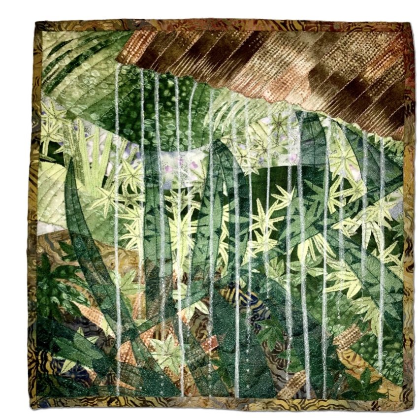
The Sound of Rain

Other times, a complementary color scheme is at work with the colors on opposite sides of the color wheel playing off of each other. One of my favorite complementary color combinations is blue/orange. In “Beach Walk”, the blues and oranges are mostly light in value with the small, darker orange rectangles adding contrast. The grays on the left side are cool grays and the gray in the top right is warm to also add some contrast.  

Beach Walk

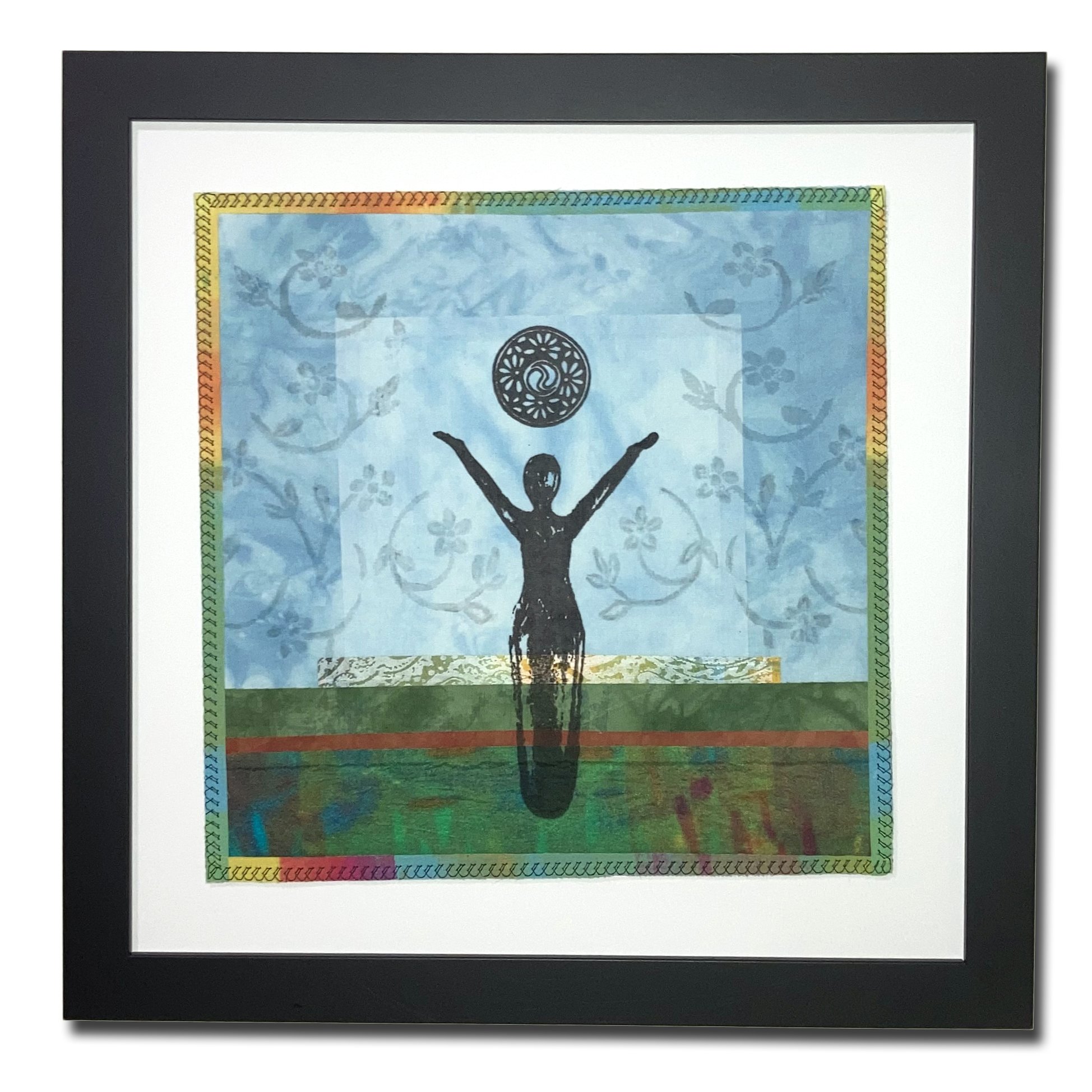
When artworks have many colors, it usually works best if only a few dominate it and others are used in smaller quantities to add interest and contrast. In “Rejoice”, the main colors are blue and green. Warm colors are added to lead the eye to move around the work and create some tension and motion.  An artist can feel when just the right colors are there to create melody support the composition.

“Rejoice”

Visit Regina’s Portfolio on this website.


Previous
Previous

Exploring New Mediums and Techniques

Next
Next

Promoting Fiber as a Fine Art Medium